How to Amplify Your Marketing Strategy With Email Accessibility
If you ask a dozen people what email accessibility is, you’ll get a dozen answers.
That’s because, at its core, accessibility is a tricky topic.
In its most basic form, it’s a way of including everyone in your audience. However, the nitty-gritty details of accessible email design make things more complex than they may seem.
Everything from font size and color to HTML elements can contribute to an email’s accessibility (or lack thereof), and understanding how these parts interact can be difficult. However, mastering this delicate interplay can have a massive payoff!
So, today, I’ll be reviewing some basic email accessibility topics to help you nail your email marketing.
What Is Email Accessibility?
There’s a lot of ground to cover in today’s blog post, so let’s dive straight into the action!
For email marketing pros, accessibility is the process of including everyone in the audience. Every user — regardless of physical status or technological capabilities — should be able to enjoy an email.
The most common angle for email accessibility is physical, and many brands carefully consider how visually impaired users will interact with content. However, there are also technological hurdles to consider! A user’s browser, mail app, and the device can inadvertently impact how a message displays.
Why Is Email Accessibility Important?
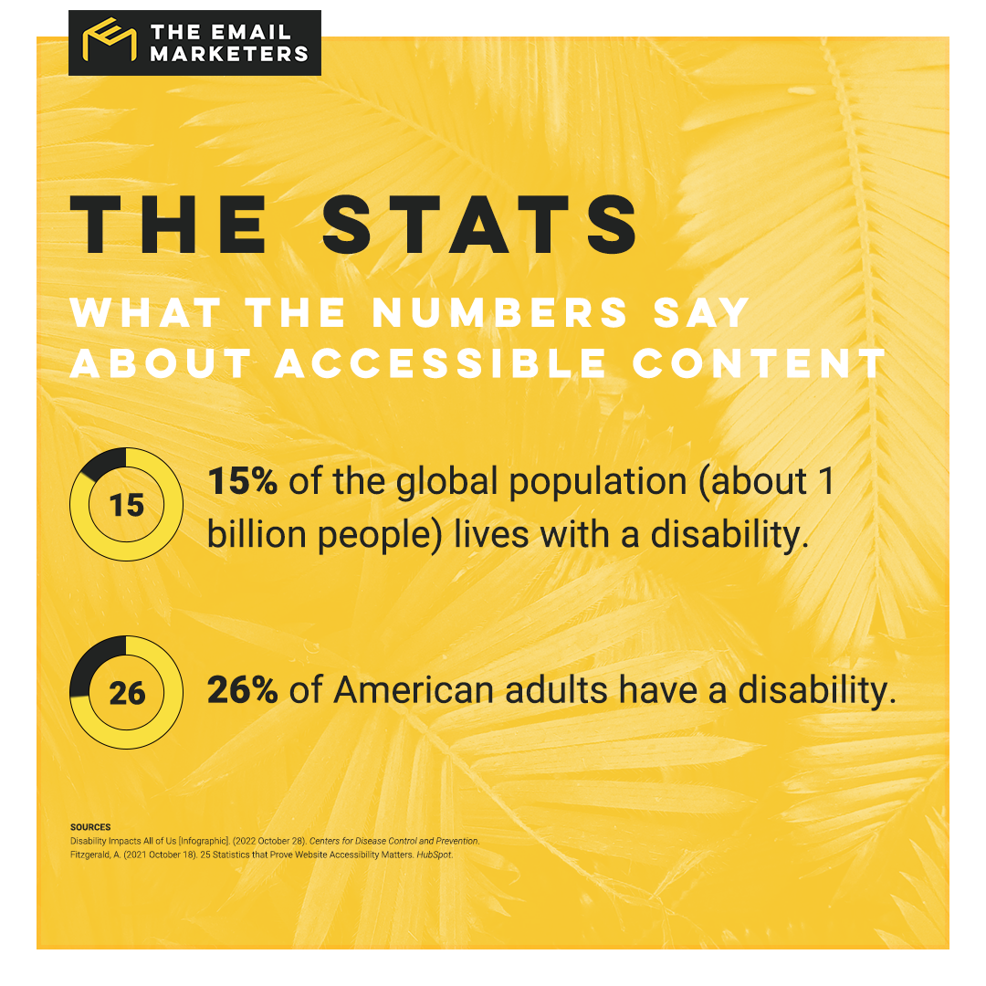
Some may dismiss accessibility as an extraneous feature for a tiny slice of the population, but there are plenty of practical benefits to creating accessible emails.
Campaigns with accessibility features tend to perform well, and users will take note of a brand’s efforts to be inclusive. In fact, many of accessibility’s best practices benefit everyone!
Even outside the context of physical disability, accessible email attributes can improve a user’s overall experience. For example, many email clients block images from untrusted addresses. However, alt text is always available, allowing users to see images that may otherwise appear as blank space.
If you’re somehow still not convinced that email accessibility is important, then consider this: A lack of accessible content may land your brand in murky legal waters.
Legal battles over digital access are rising, and failing to account for everyone could be the beginning of the end of your company, and I’m not just saying that for dramatic effect. The Wall Street Journal backs the claim, noting that 74% of all digital accessibility cases are leveled at e-commerce brands.
Ultimately, accessibility issues impact everyone, and including backups for complex elements will always pay dividends to the sender.
Basic Accessibility Guidelines
In a few paragraphs, I’ll be splitting this post into different sections for each major branch of email accessibility. However, I’ll start with a few standardized tips every email marketer should know.
Many of the tips you’ll see here are provided by the World Wide Web Consortium (W3C), which influences web accessibility standards. The same organization also offers plenty of free accessibility testing tools, including color contrast checkers and font size evaluations.
Take Advantage of Alt Text
When including any non-decorative images in an email, an accessible marketing strategy will also plan out descriptive image alt text. This bit of code is hidden for most people, but it’s an essential element for visually impaired users.
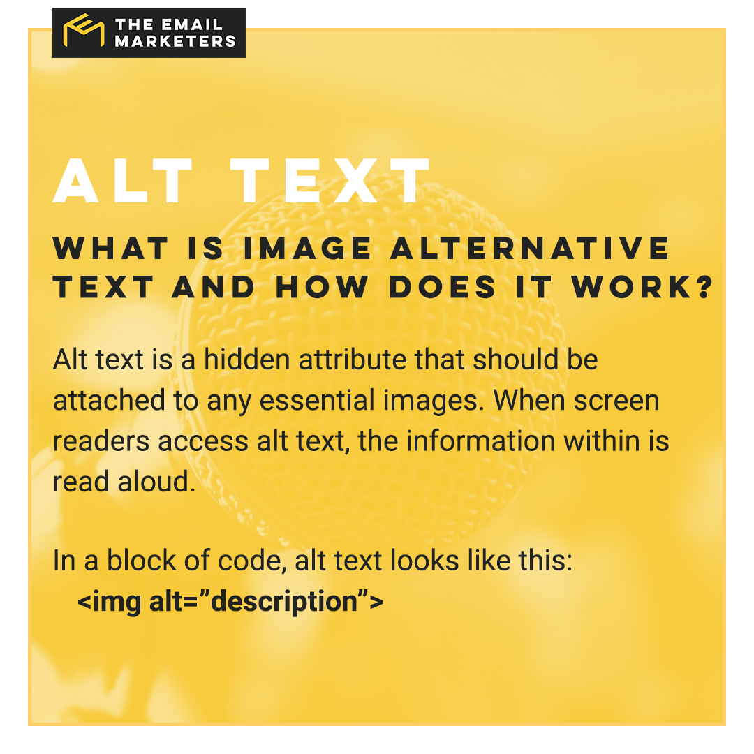
These small details are massive steps towards making every email accessible, and their inclusion helps users without assistive technology, too! When images fail to load — which may happen if they are blocked or the user has poor internet access — most email service providers default to displaying alt text.
However, before you start adding alternative text to every image, there are a few caveats you should know, namely:
- Apply Alt Text Wisely: If any image is non-essential (i.e., decorative patterns, swirls, or additions), it needs no alt text. Including a blank alt text tag (alt=“”) will tell screen readers to skip this decorative visual element.
- Be Succinct: Most alt text should be a few sentences or less. Avoid making assumptions about figures and include only essential information.
- Consider the Context: While most emails are fairly short, some newsletters may require more extensive alt text. An image of a house in one email can be described succinctly in one newsletter yet require a longer explanation in another. Think of the context and tone of the surrounding text to inform your alt text.
- Offer Multiple Options: For complex images (i.e., infographics or diagrams), include plenty of context in the surrounding text. However, pertinent information should be restated in the alt text as necessary.
Master the Art Of the Accessible Subject Line
Even (or perhaps especially) in the world of accessibility, subject lines are one of your most important assets. If a user's screen reader has trouble because you're over-using punctuation, all caps, or have a really long subject line, the chances of them opening your email are pretty dang low.
Having a succinct, descriptive subject line is something you should strive for on every campaign, but it can be hard to break the ALL CAPS habit. Try emojis or a really vivid verb or adjective to help your email message stand out instead.
Make Link Text Obvious
Again, this is one of those accessible email tips that positively affect a wider audience.
By making your link text large and obvious, you’re catering to a massive audience. There are, of course, the most obvious targets. Users with limited vision, movement, and cognitive impairments will enjoy feeling included. However, you’ll also make things easier for readers who have trouble using technology in general!
For the best outcome, consider multiple accessibility issues as you format each link. There will be users with visual impairments, fine motor control issues, and poor tech skills. To properly accommodate everyone, mix and match some of the following standards for link text:
- Buffer Space: Even the best of us have trouble clicking those tiny links on mobile devices. Give important links plenty of breathing space with white space and hard-coded buffer zones.
- Clarity and Context: Avoid vague statements like “Click here.” Instead, use descriptive link text. Good examples include phrases such as “Shop the Store” or “Browse the Sale.”
- Color Contrast: Make links a different color from the rest of the text. This signals that it is a valid way to access more content.
- Ditch Plain Links: While it’s already poor practice, some businesses still insist on sending emails with plain copy-and-pasted links. These URLs will then be read verbatim by screen readers!
- Know Your Code: Including properly implemented links goes a long way. While flashy graphics may capture some viewers, those using keyboard navigation tools will find that they cannot properly interact with the message. To account for this, always include plain text fallbacks for every email!
Designing for Cognitive Disabilities
While assistive devices — such as screen readers and eye-tracking software — are commonly integrated into modern, accessible email designs, many brands fail to account for cognitive disabilities.
This wide umbrella term includes users with dyslexia and dyscalculia and for whom reading is difficult. By extension, the measures explained in this section also benefit users who speak different languages.
Avoid the Flowery Fonts
As far as global accessibility standards go, one of the biggest sins is using overly decorative fonts.
Though eye-catching, many embellished fonts are hard to read. They may be acceptable for short, emphatic elements, but they should never be the bulk of a message.
The best way to demonstrate this concept is through visual content, so take a quick look at this image:

Which message is easier to read?
The same loops and embellishments that give the upper text its pop also make it difficult to read! If a user already has an existing barrier (i.e., dyslexia or English as a second language), they’ll struggle or fail to understand the image.
Conversely, the bottom text is written in one of the many legible sans-serif fonts included on every operating system. This ensures the image is easily parsed by any recipient, and it doubles as a simple way to ensure everyone understands your email campaigns.
Want to boost your font choices even more? A few small steps you can take to enhance the readability of your email campaigns include:
- Avoiding All Capital Letters: While ALL CAPS is fine for short actions or phrases, it should never be used for anything longer than two lines. (Using capital letters also tends to interfere with certain screen reader applications.)
- Planning Out Design Elements: Your brand’s font should be chosen carefully. Sans-serif fonts are the most legible choice, although serifed fonts can also work. However, monospaced fonts (those that look like a typewriter printed them out) should be avoided, as they are difficult to read.
- Spacing Out Content: Breaking long statements into shorter chunks helps everyone understand the content. Brands should also consider consulting a graphic designer about spacing, line height, and kerning.
- Using Consistent and Legible Fonts: An email is not an embroidered pillow. You only need a handful of fonts to convey your message. Two or three different fonts will usually suffice.
- Using Standard-Sized Text: 16-point font size is the standard for most body text. Some fonts run larger than others, and 12-point is acceptable in some contexts.
Cut Back Those Columns
It may work for newspapers, but a multi-column layout is unacceptable for emails.
Aside from the obvious challenge of ensuring every user has the same experience, making mobile devices display multi-column messages properly is impossible. Content will be too cluttered, and images often overflow into improper spaces. This tip also applies to emails formatted into tables.
Instead, use a simple single-column layout. This format will always look good, and it displays perfectly across multiple webmail clients. A single-column layout also simplifies navigation for individuals using a screen reader.
Use Simple Language

The best copy is easy for a 13–15-year-old to read.
This guarantees the widest possible reach and reduces misunderstandings. To achieve this goal, ensure that your copy conveys clear and accurate information. Some of the best ways to make your content more accessible on a cognitive level include:
- Avoiding abbreviations and slang (when appropriate)
- Breaking content into smaller sections
- Explaining advanced content
- Using basic language
- Using smaller blocks of text
Now, using inclusive language can be tricky.
Know your audience before you commit to a voice. While a younger audience will understand abbreviations like LOL and OMG, an older crowd will struggle to understand these colloquialisms. Likewise, a B2B marketing strategy can use industry shorthand more freely than a B2C newsletter.
Designing for Physical Accessibility
Another category of accessible content focuses on ensuring users with mobility problems can easily access and interact with emails.
This section aids users with conditions such as arthritis, cerebral palsy, paralysis, and tremors. Users with broken arms or sprained muscles will also enjoy these features.
Give Interactions Plenty of Space
While white space helps with cognitive and visual disabilities, it also assists users with mobility problems. Adding plenty of padding around interactive elements (i.e., hyperlink text and buttons) ensures users won’t accidentally click on the wrong item.
As a general rule, every major interaction should have its own line of text. Additional buffer zones can be added as needed, especially when the email does not contain larger images or buttons.
Mind the Length
While I’ve already covered this in the cognitive accessibility section, the length of your email will also impact its physical accessibility.
Think of it this way: If a user has a hard time using a mouse or scrolling on their phone, long emails become a chore to read. By condensing your content and using outbound links for long-form pieces, you ensure more people can understand your message.
Some of the best ways to ensure every user understands the content without excessive interaction include:
- Creating collapsible sections within email messages
- Including links to longer articles
- Limiting unnecessary patter
- Offering dynamic emails for customized viewing
- Placing essential information at the top of an email message
Designing for Visual Accessibility
Finally, you’ll want to consider how users with visual impairments and screen reader users will interact with your content.
While we’ve already covered alt text, there are other ways to accommodate customers with visual impairments. Many groups — including the International Standards Organization — have established basic guidelines to create truly accessible visual content.
As with all of these tips, the information in this section benefits your entire audience. Small tweaks make it easier for everyone to read content, and high-contrast visuals improve the visual impact of your campaigns.
Consider the Contrast
In web design, text has a property known as the contrast ratio. This number measures the difference between the text’s color and the background. Crucially, the standardized contrast ratio works across all devices and brightness settings, and there are many free tools available to check yours.
This standard focuses on improving readability for users with vision impairment and color blindness, but many others find that improved contrast makes messages easier to read. 4.5:1 is the minimum contrast ratio for normal body text, although designers can go down to 3:1 for large text.
7:1 color contrast is the gold standard for normal text.
If you happen to be using rich text formatting for your emails, remember that plenty of users also have dark mode enabled. Designing your emails to accommodate this alternative viewing mode will improve the overall viewing experience for everyone, and it’s a welcome relief during late-night email checks.

Some of the best practices for improving your color contrast include:
- Avoid placing text over noisy images
- Create adaptive email campaigns that can be adjusted by the user
- Never pair a dark font color with dark background colors
- Never pair a light font color with light background colors
- Use tools to check for appropriate color contrast
If you need a quick way to check the color contrast of any text, find a bright space and turn your screen’s brightness all the way down. If you can still read the message, great! If not, you need to play around with the colors.
Think About How Things Sound
I’ve already touched on screen readers, but this is the perfect time to elaborate.
When using a screen reader, certain elements will be read aloud. In addition to headers and body text, users will also hear the description for every image with an alt attribute. So, think about how that will sound.
Do all of your image descriptions sound the same? If so, edit your alt text to be more varied. As you do this, be sure to add a null alt attribute for any irrelevant images. Otherwise, screen readers will get hung up on those design elements.
If you’re writing your emails from scratch with HTML, use proper semantic code.
Headers make a difference! Screen readers read these additional context clues and organize the email content accordingly. Users utilizing keyboard navigation will also benefit from organized email messages.
Putting Everything Together

So, let’s put everything together.
What does it mean to make an email accessible?
How can your brand start creating accessible emails, and what changes will be made to ensure continuous inclusion?
There are so many questions and few concrete answers. Every user has unique needs, and the customization options of many webmail clients — from iOS mail to Gmail — can make designing the perfect email message difficult. Moreover, adding white space to certain designs may break the entire email!
However, when you weigh the pros and cons, the result is always the same. Making accessible emails is always the best choice, even if it isn’t the easiest option.
The little touches you add to combat color blindness will help one reader see your email campaign on a sunny day. The extra white space around those links will be appreciated by the mother bouncing her baby in her other arm. That meaningful link text aids the harried businessman rushing to his next meeting.
Accessibility issues impact everyone, and I’ll say it again and again!
The tiniest details make a huge difference, and your moment of thought can become a lifetime of dedicated customers.
The Top Five Takeaways for Email Accessibility

I won’t sugarcoat things: Web accessibility is a massive topic, and that’s why I’ll need more than one blog post to properly explain everything. This is just the introductory course! There are plenty of other things to learn, and those tidbits will make your emails accessible to an even wider audience.
However, everything must come to an end.
To wrap up this blog post, here are the top five things you should remember about accessible emails:
- Design for Diversity: There are countless email clients, and each displays messages differently. Always have backups and fallbacks for advanced elements.
- Don’t Neglect Your Negative Space: White space is an essential buffer zone for interactive elements. Hyperlink text, buttons, and clickable images should be accompanied by a generous frame to accommodate shaking hands and errant taps.
- Know Your Audience: Speak to your audience. Know what terms your readers will understand and avoid complex industry jargon when necessary.
- Take Advantage of Contrast: Keep your contrast ratio high. All of your text should be easy to read without straining.
- Test Everything: Don’t hesitate to check all of your messages before you send them. See how everything sounds when narrated by a screen reader and ask others if the message is easy to understand.
Enlisting Experts
Feeling overwhelmed?
If you’re feeling lost, that’s understandable. This is a complex topic, and knowing how to implement and handle the many moving parts can be difficult. Fortunately, this is only the first of a series about making email accessible!
Moreover, as a small business owner, you don’t have time to worry about tiny details in emails. However, you still want to include everyone in your campaigns.
The Email Marketers can help.
My team of experts understands the intricacies of email accessibility, and we can help your brand expand its accessibility.
Give me a call, and we can discuss the perks of enlisting marketing experts! Don’t forget to check my blog, too, because more accessibility posts will be coming soon.
.png)


